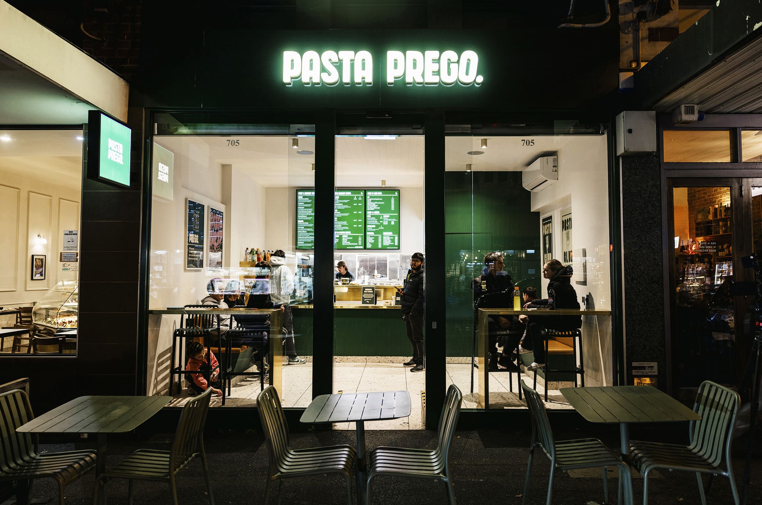
Pasta Prego takes a simple idea—fresh pasta that’s quick, fun, and accessible—and builds a strong, memorable identity around it. The design is not just about making a shopfront; it’s about creating a place where the brand is felt as much as it is seen.
From the street, the glowing green sign acts as a beacon. It’s bold, playful, and unmistakable, instantly telling passers-by what the store is about. Step inside and the same identity is carried through every surface and detail. Deep green panelling, polished brass counters, and terrazzo floors create a look that feels sharp, modern, and approachable. Nothing is wasted—every material choice is part of the story.
Brand and space are inseparable here. Posters with cheeky graphics, digital menus, and even the seating reinforce the tone of voice: energetic, a little irreverent, but always welcoming. Customers don’t just come for pasta; they come for an experience that feels fun, fast, and full of personality.
The open kitchen turns food preparation into theatre, connecting people directly with the product. Steam rising from the pans, cooks at work, menus glowing above—it all builds into a lively rhythm that matches the brand’s energy. Flexible seating at the window, benches along the wall, and lean tables ensure the store supports both quick visits and casual catch-ups, without breaking the flow.
What makes Pasta Prego original is the way it treats branding as the architecture itself. The colour, the materials, the signage, the graphics—they aren’t add-ons but the core of the design. The result is a space that is instantly recognisable, easy to replicate, and deeply tied to the identity of the business.
Pasta Prego shows how a strong brand can be more than a logo or a colour—it can become a place, an atmosphere, and a way of experiencing something familiar in a completely new way.

