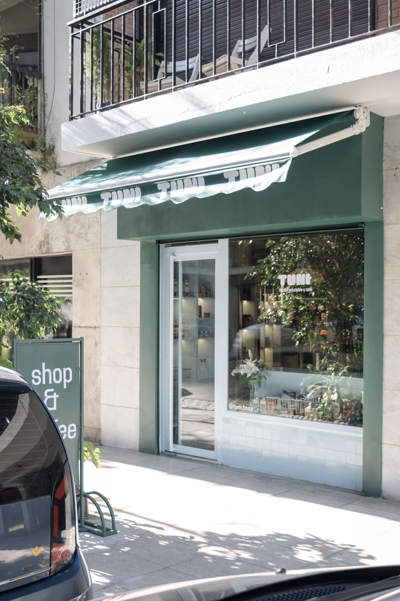
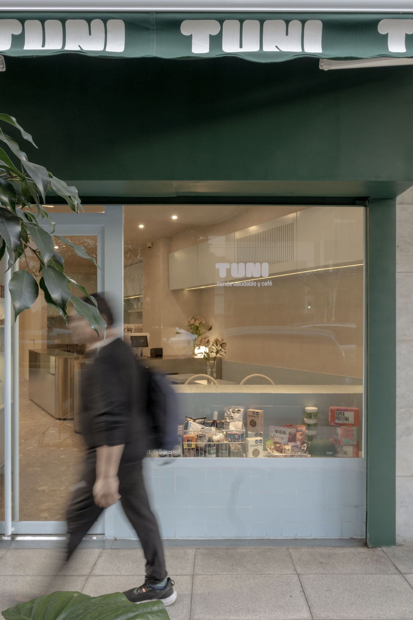
“TUNI Universe: where the everyday becomes special, without ceasing to be simple.”
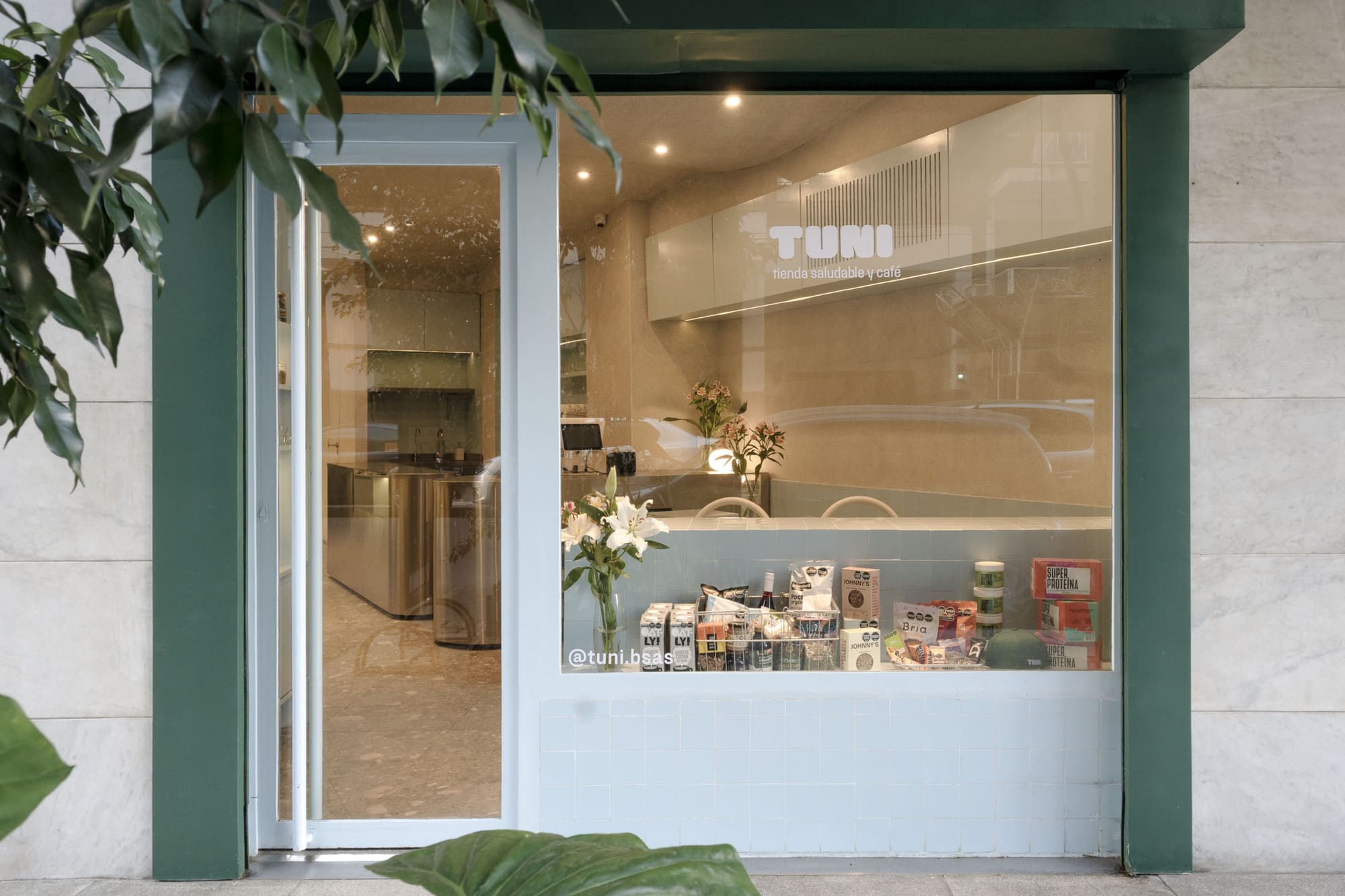
TUNI was conceived not only as a healthy market but also as a device for daily transformation—a contemporary space where the natural, the functional, and the aesthetic merge into an integral experience. From Ohio Estudio, we designed this space with a disruptive and sensitive vision, aimed at generating community, not merely commercializing products.
The project is structured around three main axes:
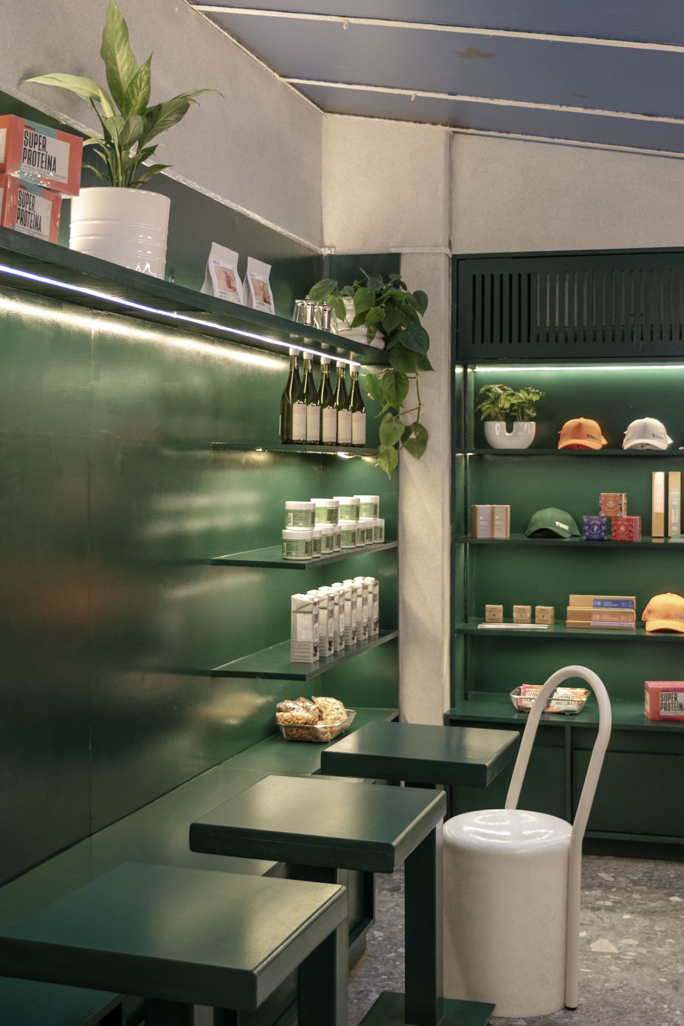
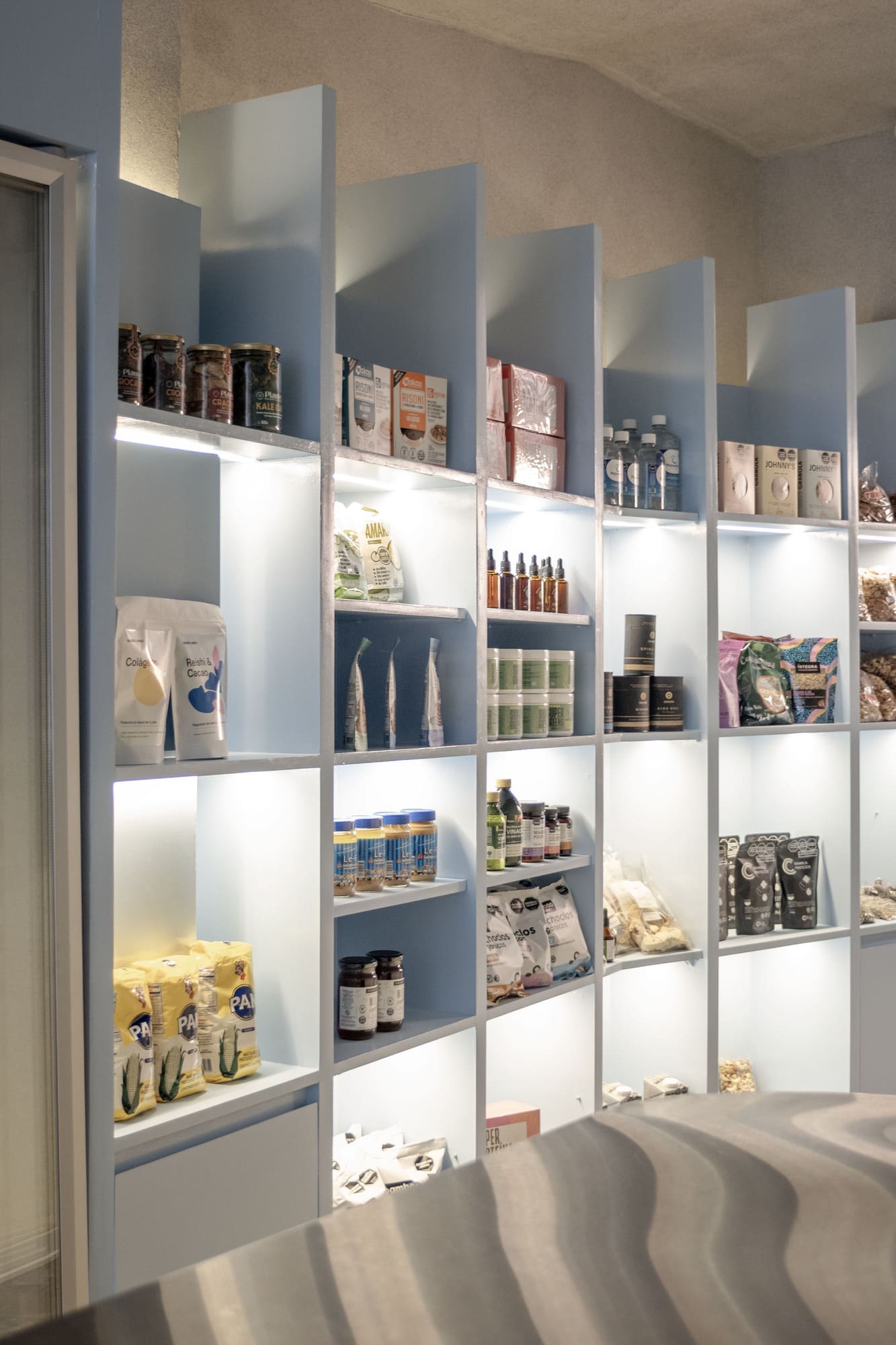
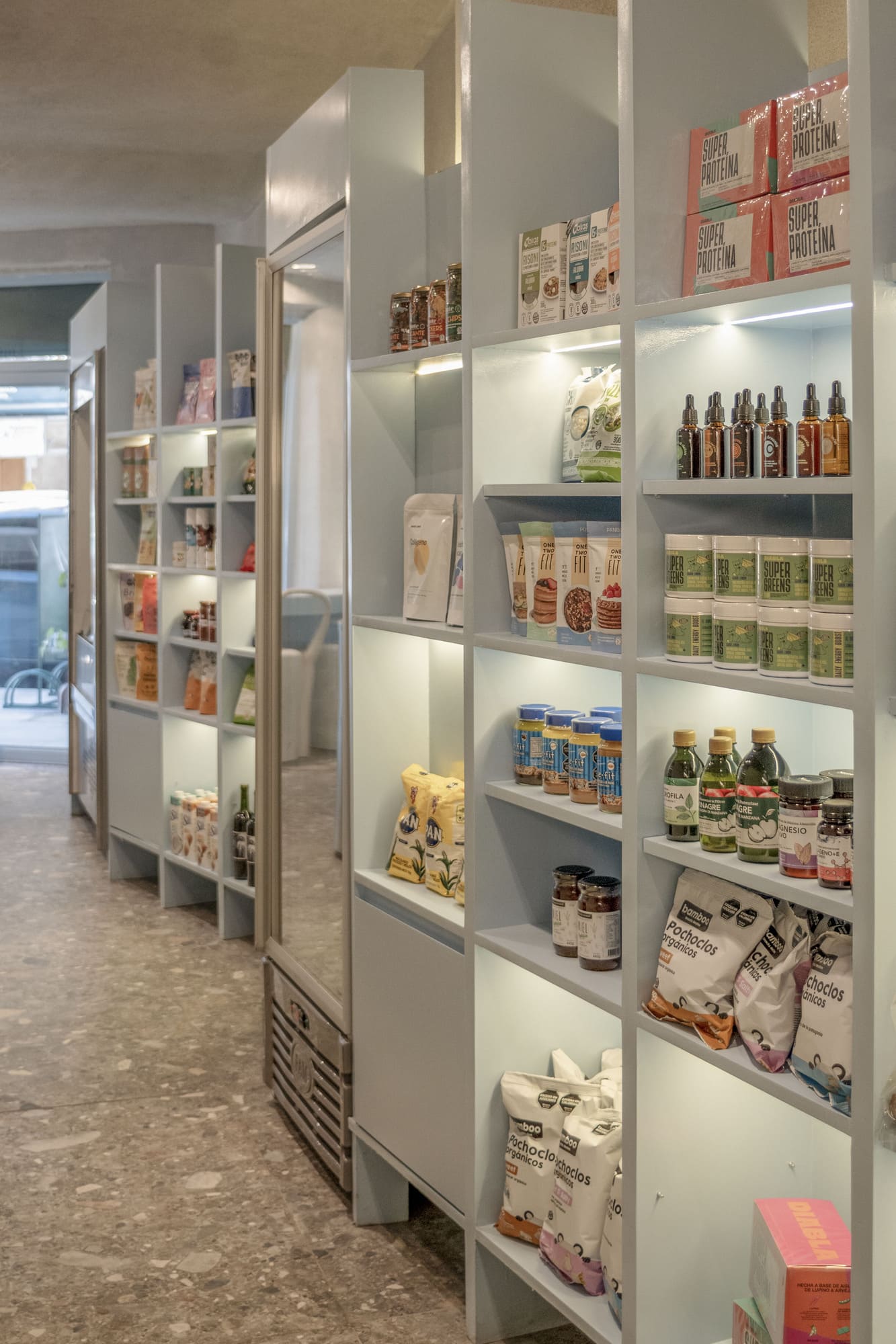
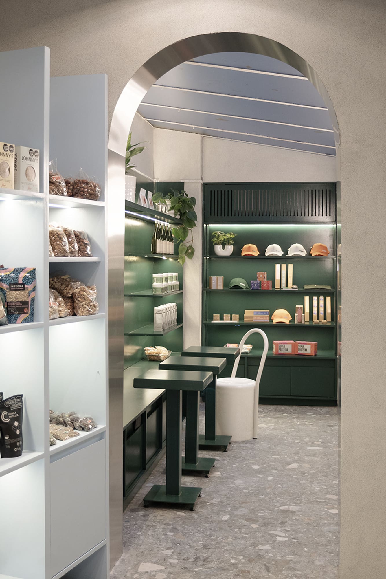
The Market: where carefully curated products selected by TUNI are displayed, with a strong focus on healthy, organic, and traceable goods.
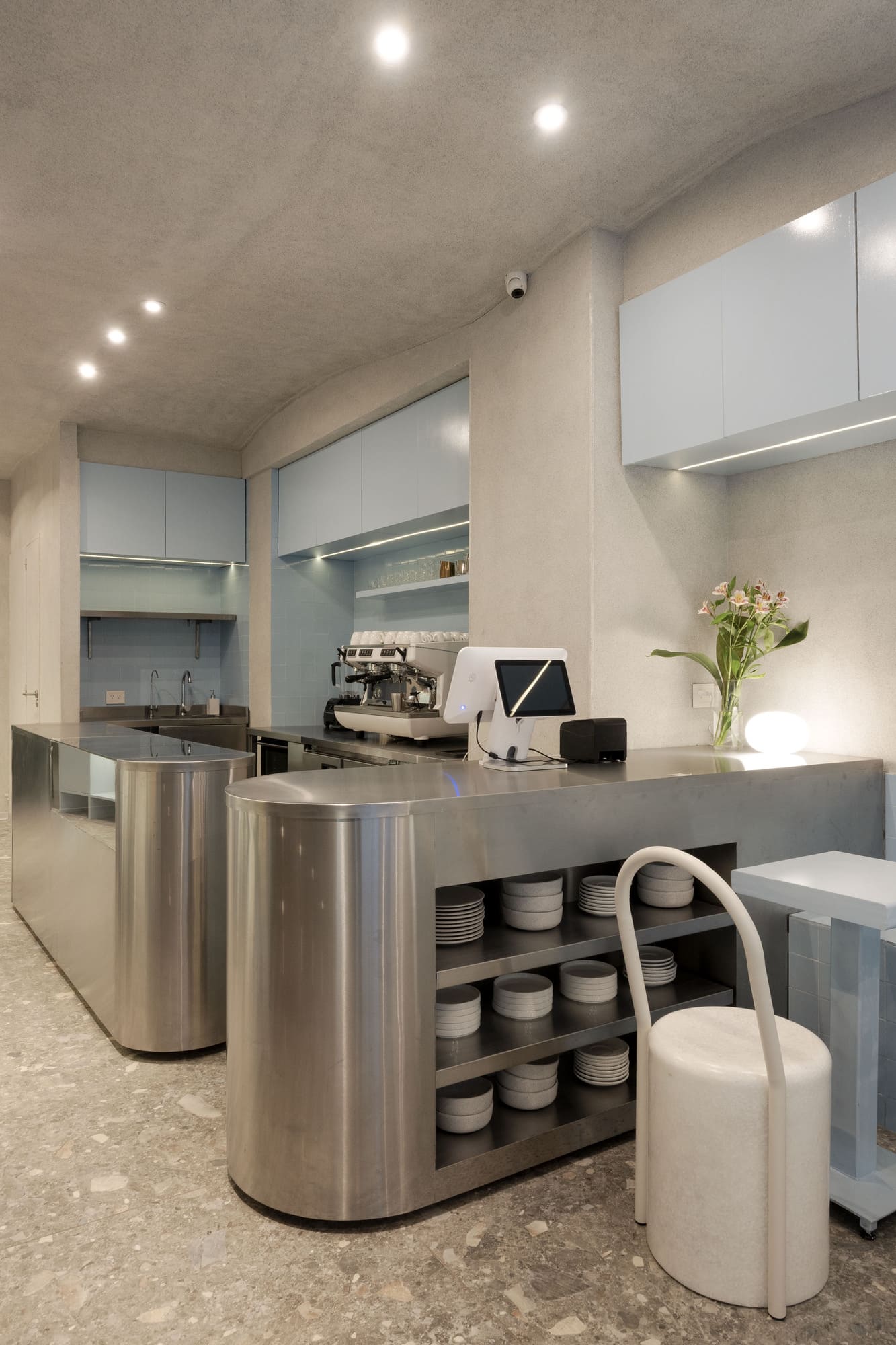
The Kitchen and Specialty Coffee: an open area where healthy cuisine options are prepared and served, along with juices, matcha, golden milk, and other functional beverages.
The Community Space: an area where users can stay, meet, and share, strengthening a sense of belonging and exchange around the project’s values.
SPATIAL AND FORMAL STRATEGY
One of the main design challenges was to work with two simultaneous speeds: the typical market circulation—fast, agile, consumption-oriented—and the slower pace of permanence, characteristic of a community and enjoyment space. To address this, the project articulates circulation and stay through a precise combination of color, texture, and form.
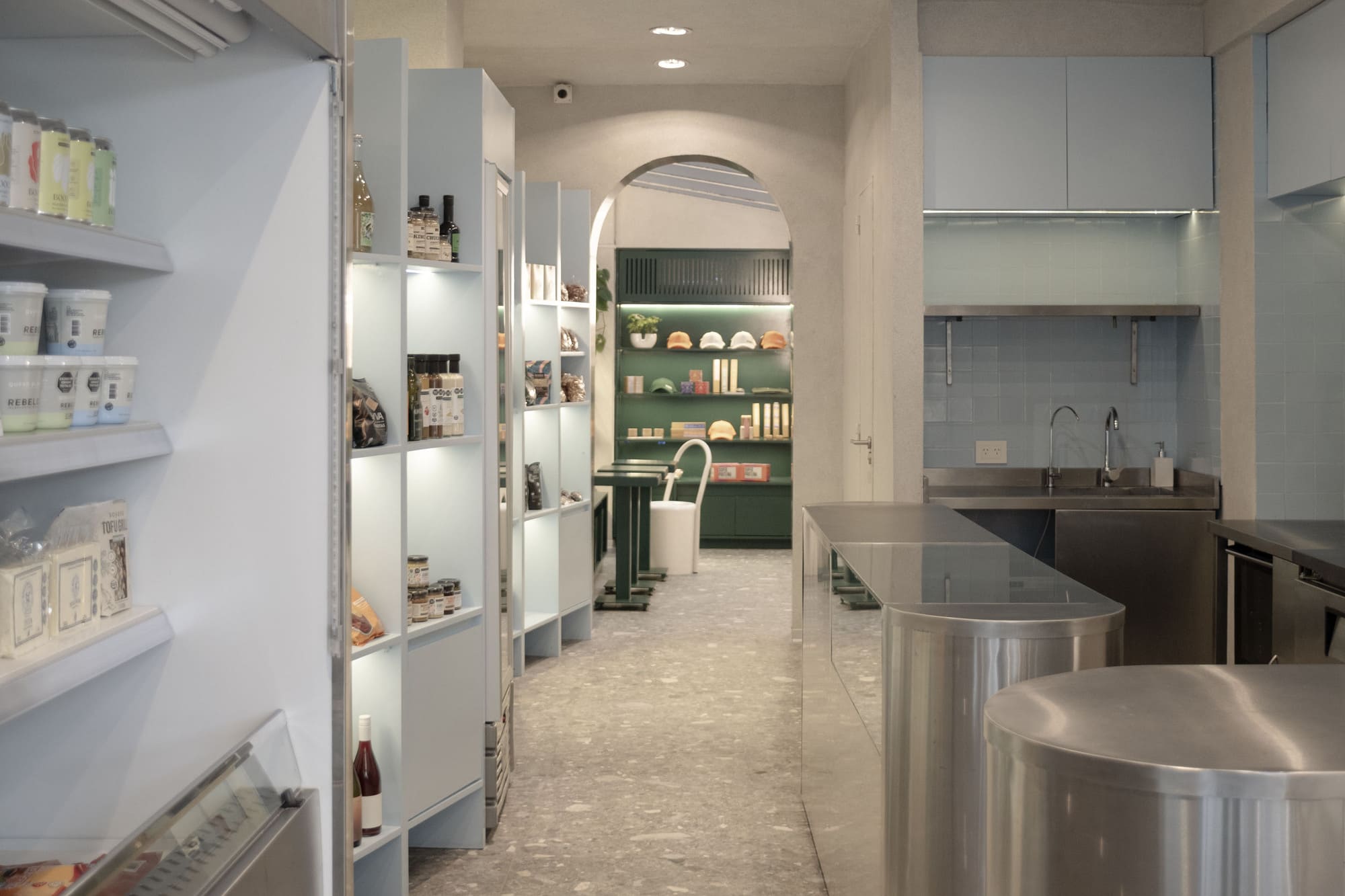
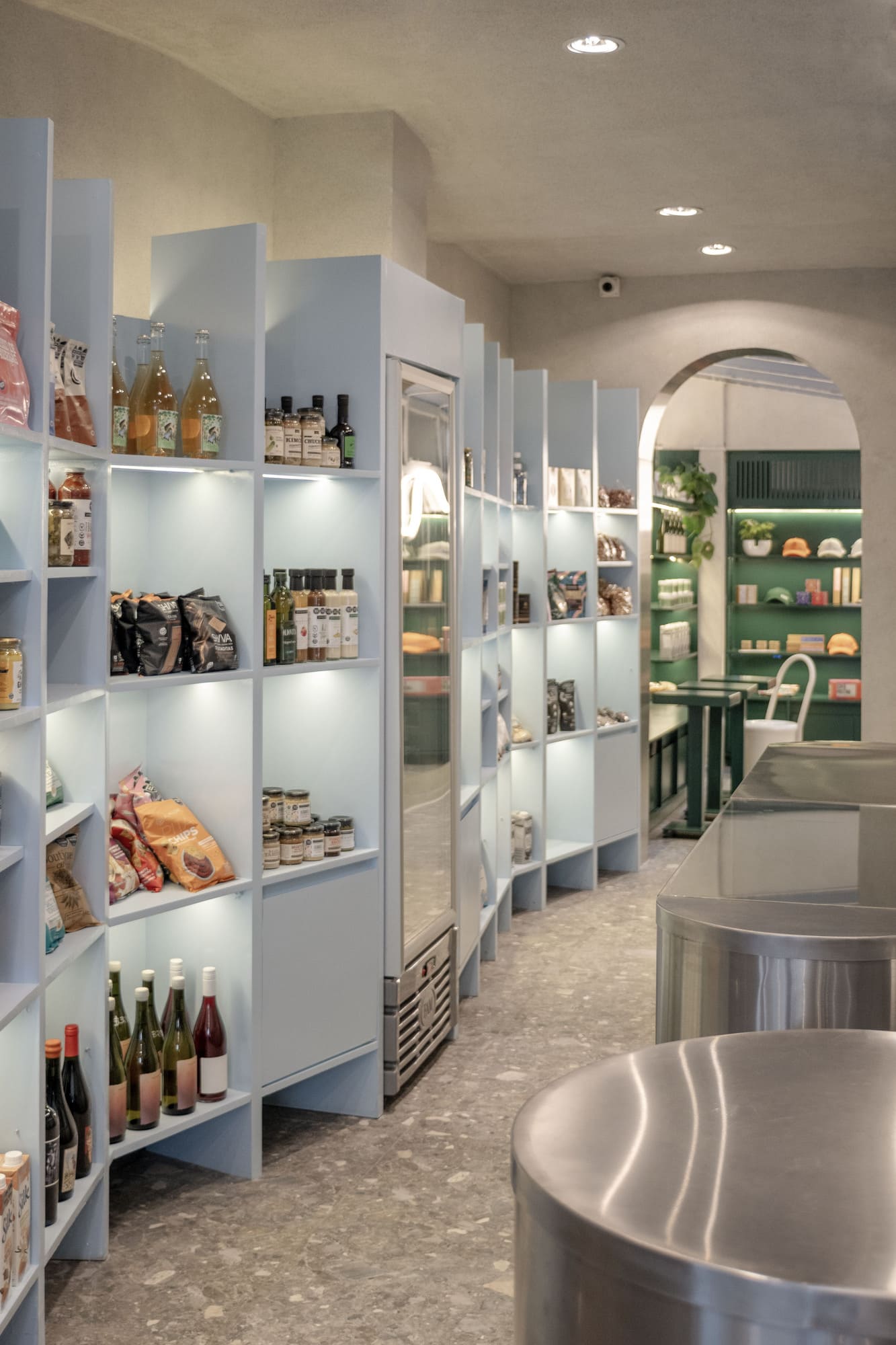
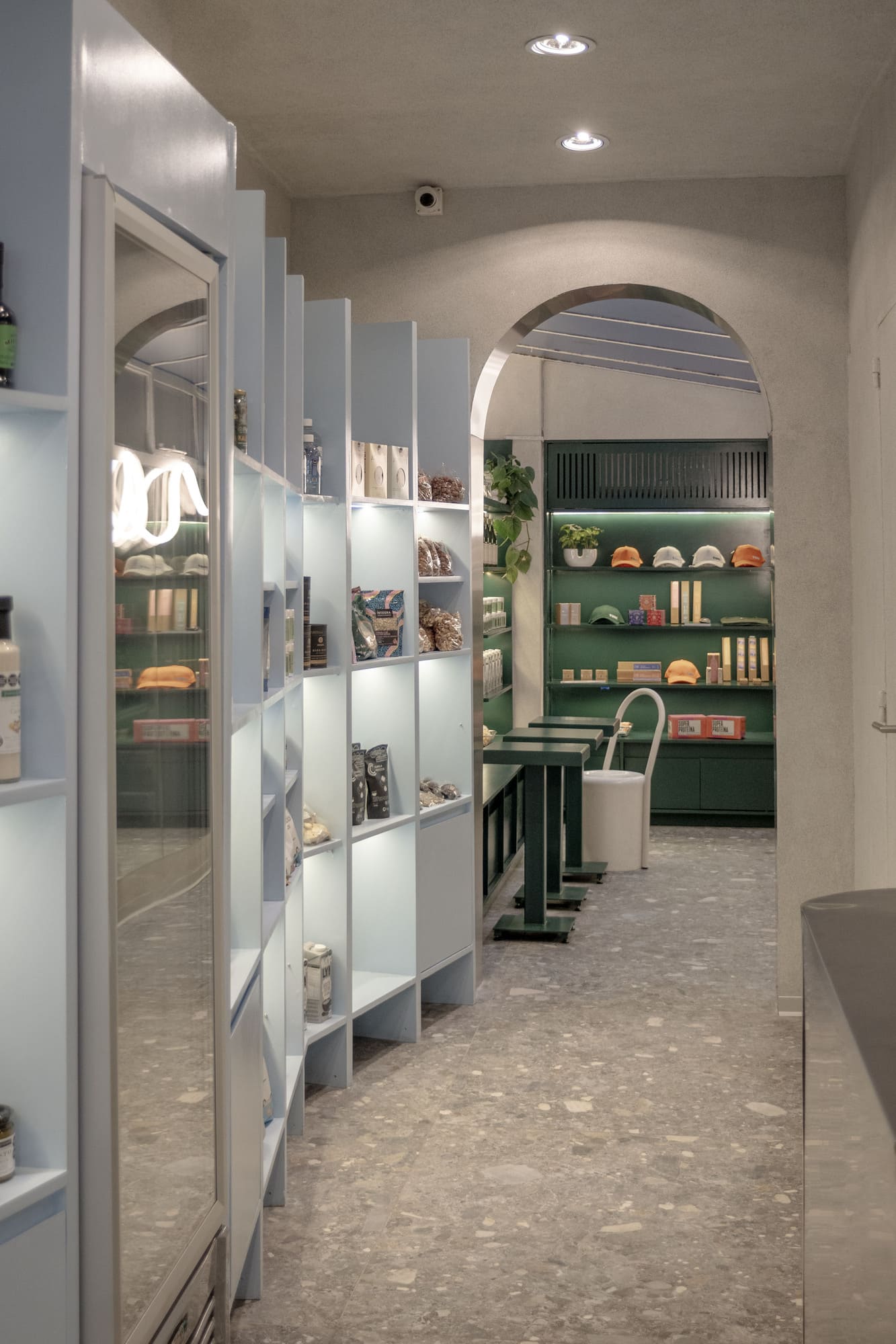
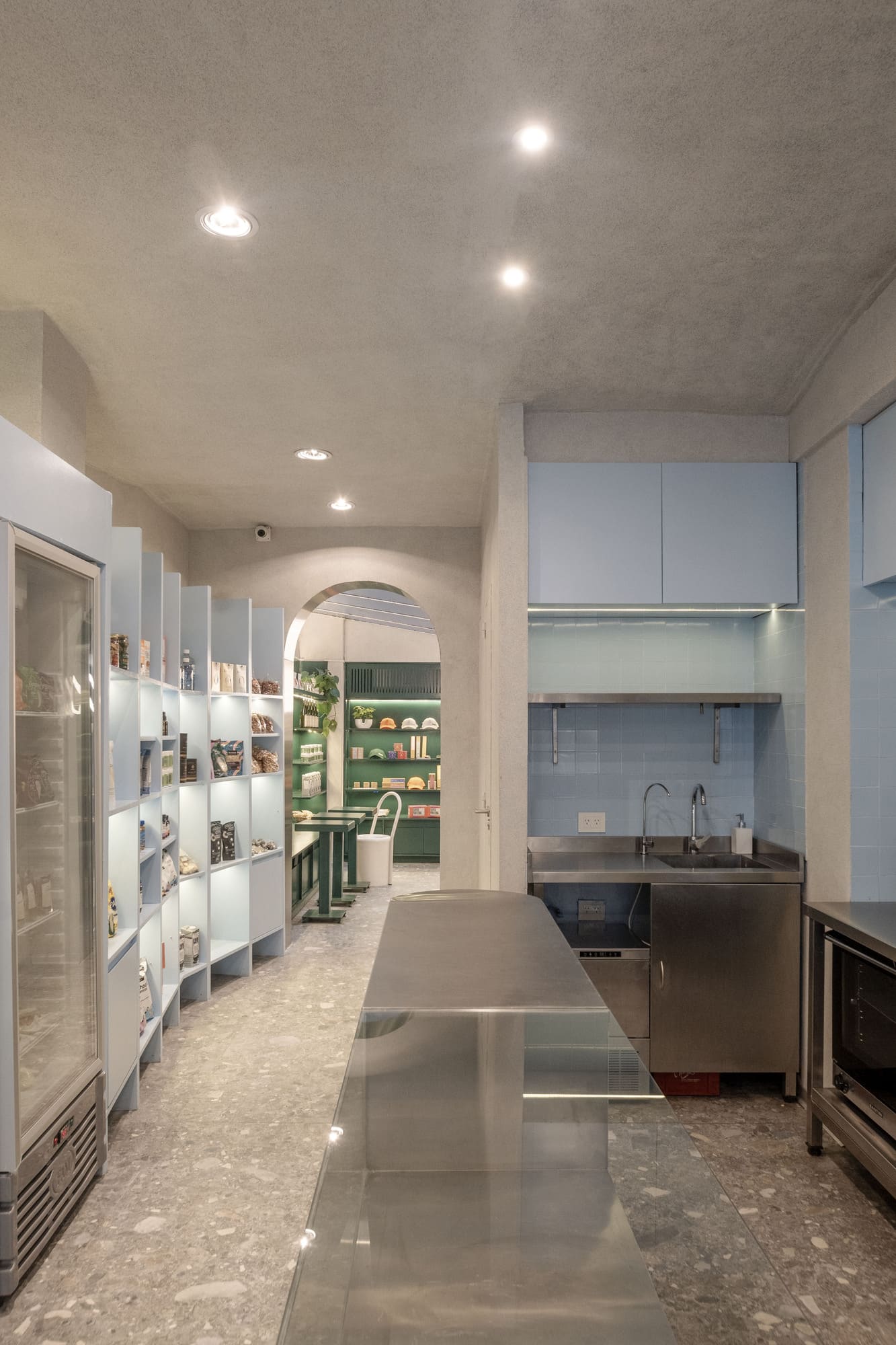
The space is organized within a desaturated, neutral box, where colored objects emerge to define rhythm, hierarchies, and uses. Color becomes object and shapes the path.
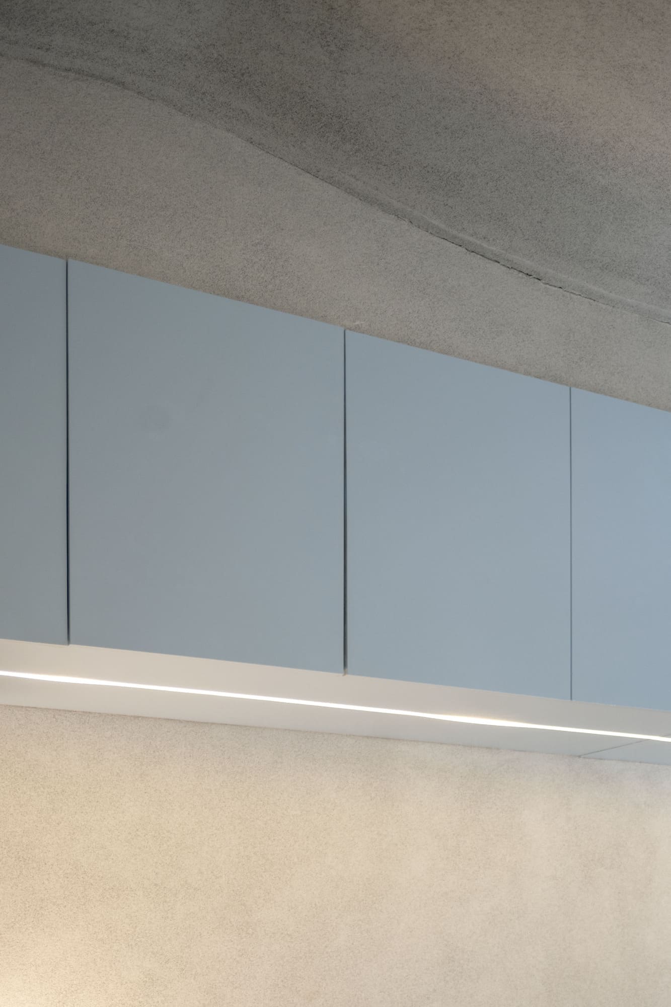
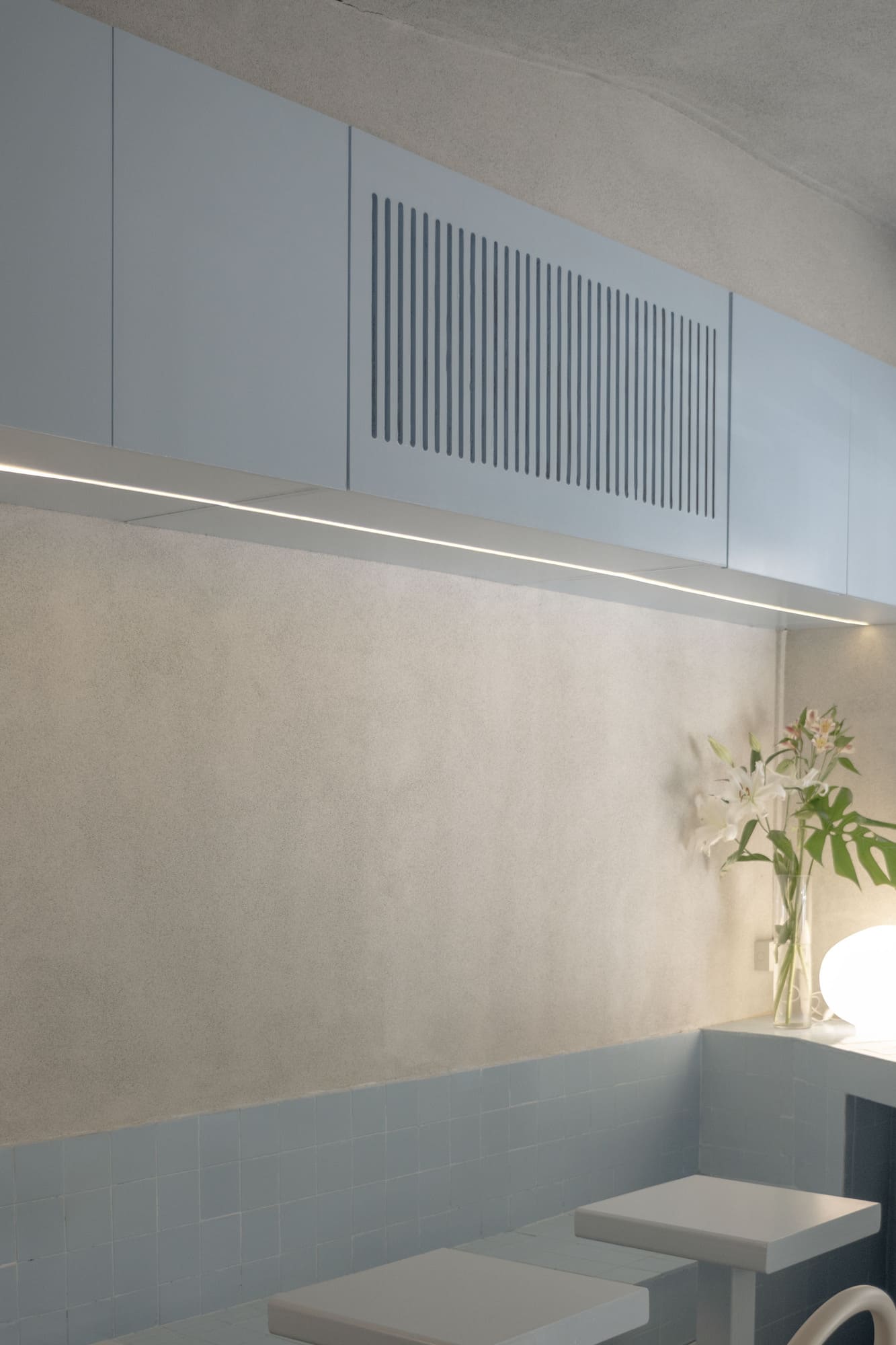
One of the main elements is the sky-blue zigzag grid shelf, which organizes the products, incorporates display refrigerators, basket storage, and adapts in height according to needs. This element not only contains and stitches together the market space, but also invites a playful, flexible, and visually stimulating journey.
In the first hall, the preparation area is conceived as a series of stainless-steel islands, evoking an open kitchen. Everything is visible: there is no backstage, no hidden processes. Each preparation aligns with the values of transparency and traceability that define TUNI.
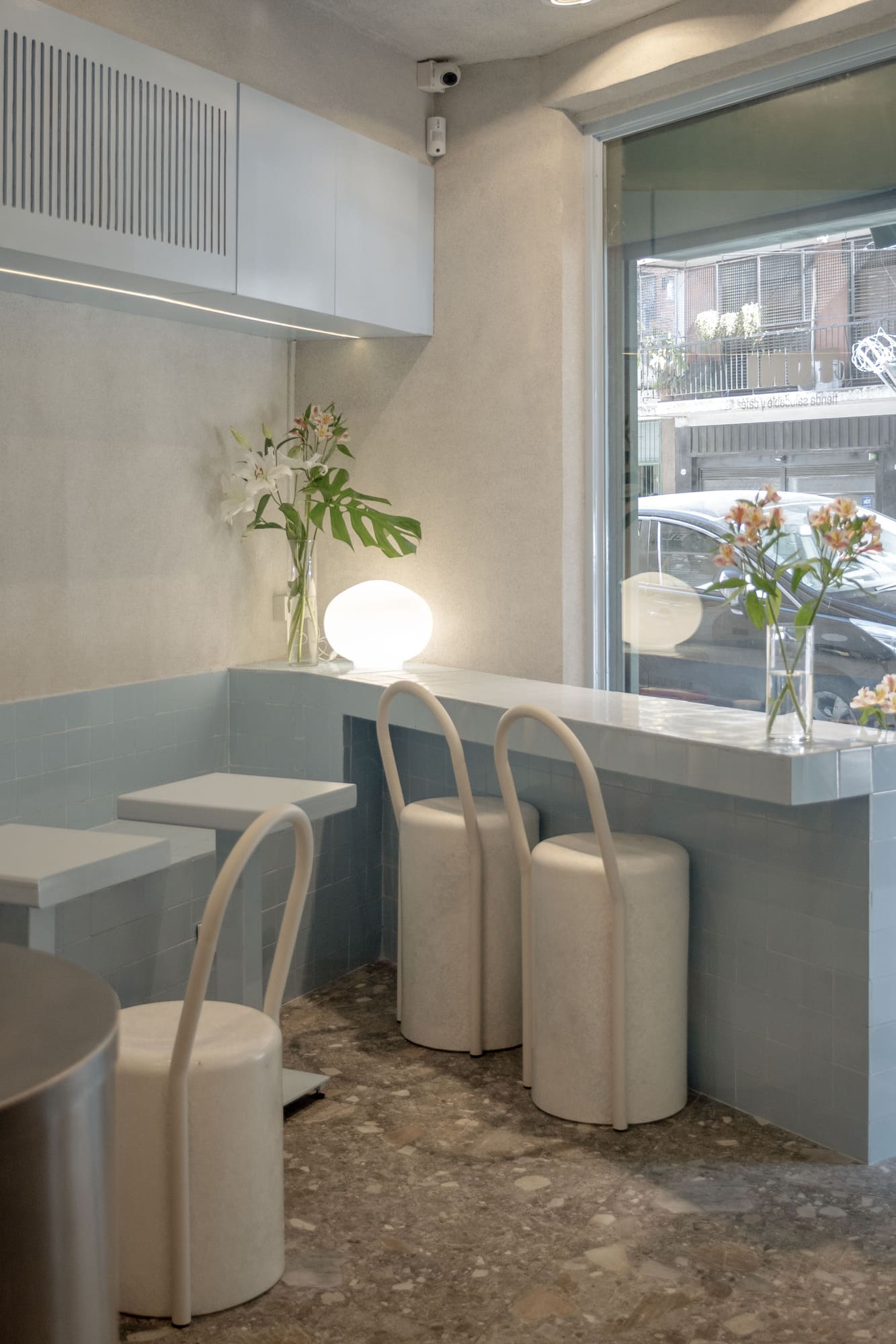
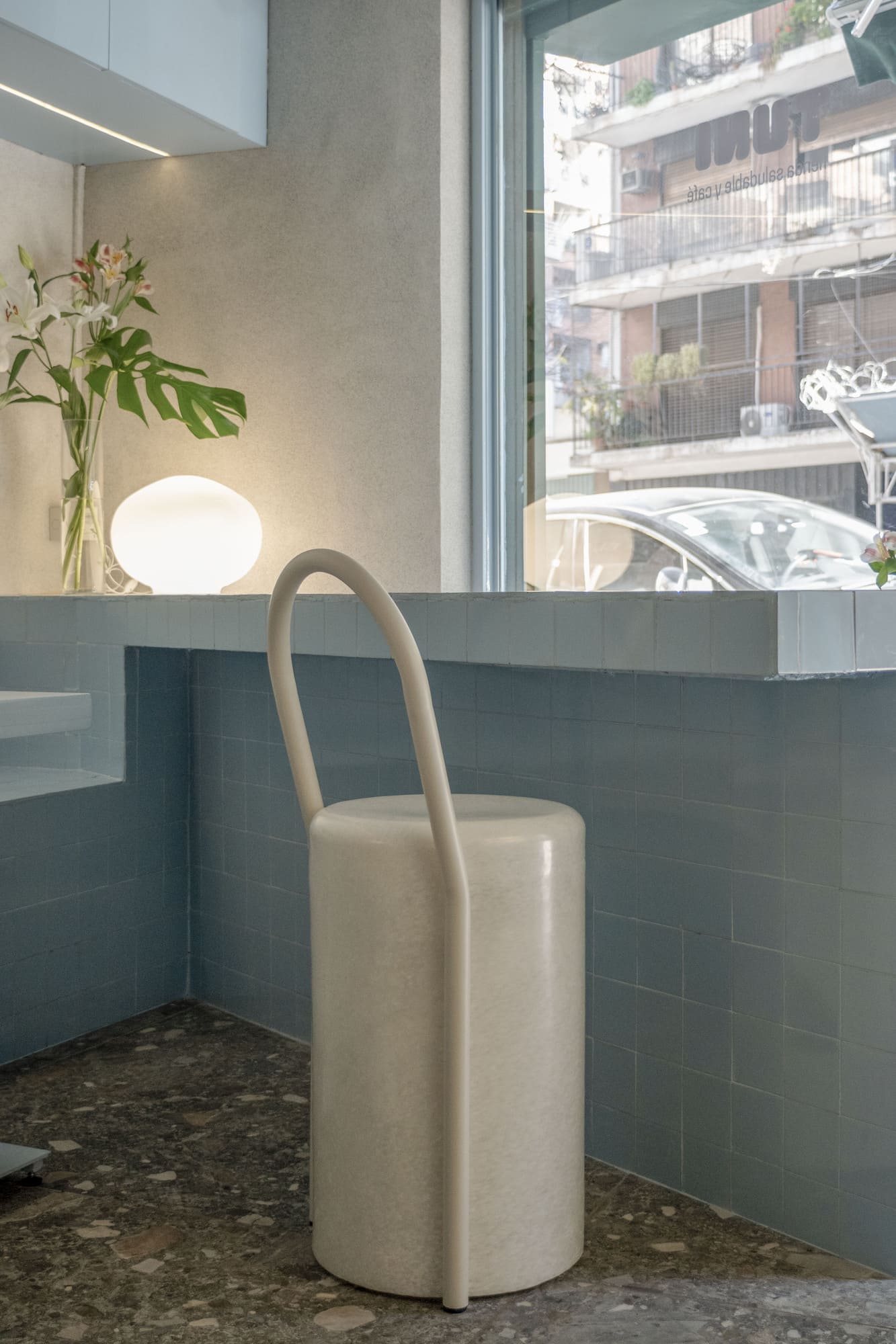
Next to the kitchen appears the first community space, resolved through fixed sky-blue tiled benches that step up and transform into a bar, creating a consumption area that also works as a product showcase. This zone clearly communicates that TUNI is a market, but also a place to taste, observe, and learn.
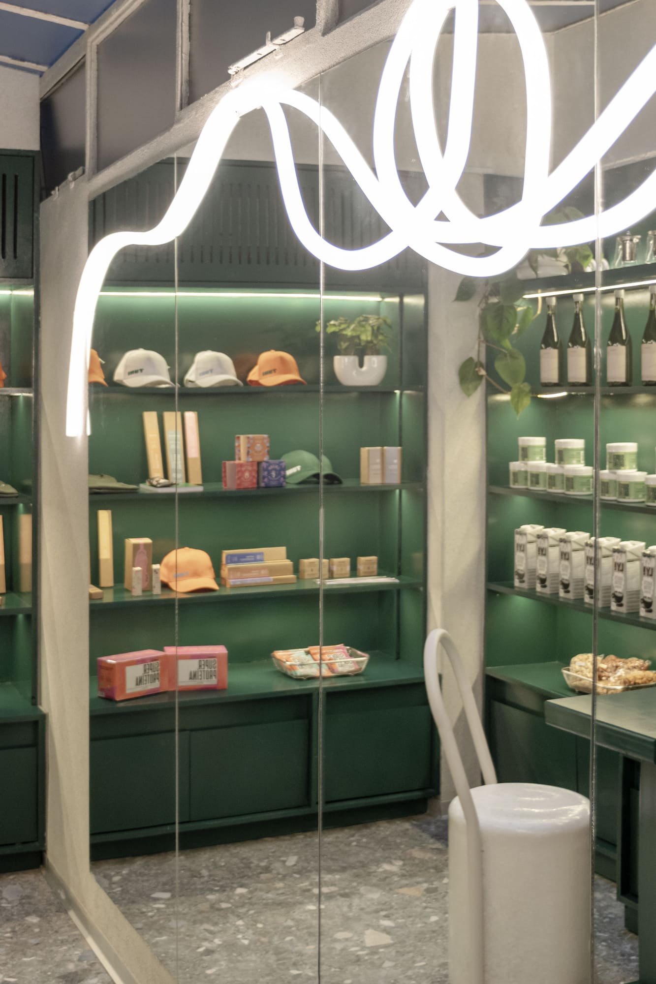
As a spatial climax, a steel arch opening leads to the second community space: the “English green space.” This area functions as a glass-roofed winter garden, surrounded by natural vegetation, mirrors with curved lights, and personal care objects. It is a sensorial space that engages both introspection and collectivity.
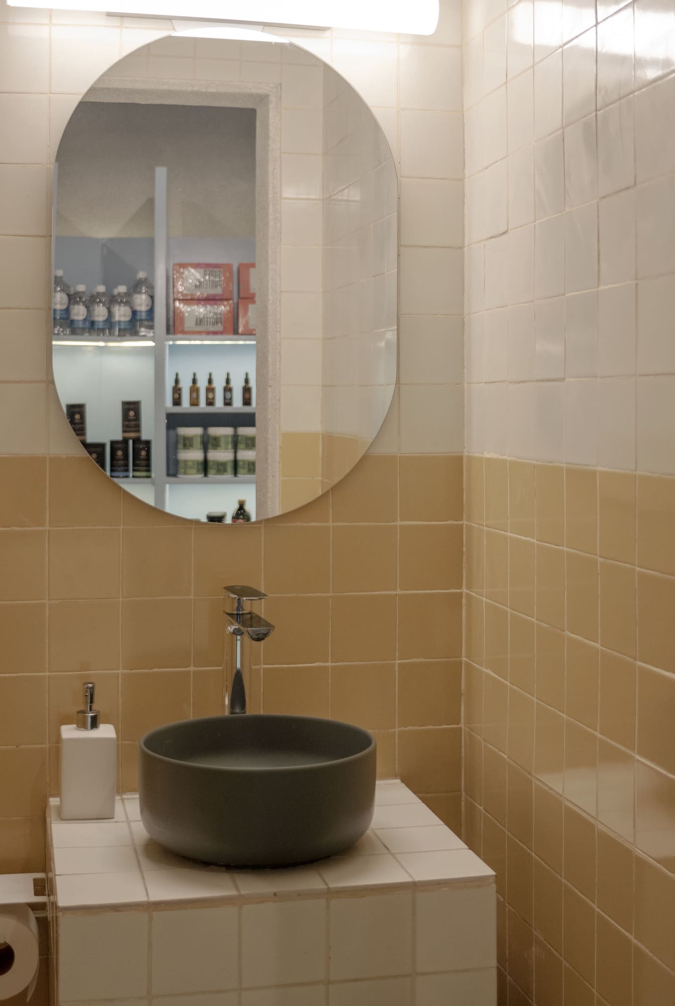
Even the bathroom is incorporated into the spatial narrative: resolved in mustard yellow and off-white, it takes the branding colors and surprises the visitor with a graphic and vibrant gesture, reinforcing the project’s visual identity.
Finally, the undulating ceiling was designed to balance the site’s preexisting diagonals—resolved in a false angle—with the zigzagging grid. This operation generates harmony between structural and perceptual aspects, establishing a counterpoint between curves, angles, and straight lines.
CONCEPT
TUNI is a balance between color, curves, and diagonals. An architecture that proposes a playful, contemporary, and organic experience, where every object has a function but also a narrative. It is a space that educates, nurtures, and connects—inviting the client to become part of a community that values the essential and celebrates the everyday.
Additionally, the chairs are original designs from our studio. They are made from recycled plastic molds produced by Mutan Studio using bottle caps. We repurposed containers they were already producing and reformulated the volumes by designing an iron structure that transforms these bins into seating, with two variations: stools and benches. In this way, instead of building something new, we rethought and recycled a preexisting element, giving it a new use.